How To Create Affiliate Banner Designs That Convert
An important part of affiliate marketing is to create effective affiliate banner designs that engage your audience and encourage conversions.
Key design elements include high-quality images, clear messaging, strong calls to action, and consistent branding. Considerations like color, typography, and generating unique banners for each affiliate are also important.
In this article, we’ll be discussing several tips and tricks on how to create affiliate banners that convert. Let’s optimize your affiliate program and boost your conversions!
Understand the Role of Banner Designs in Affiliate Marketing
Just as a billboard can encourage a driver to stop at a particular restaurant or store, a well-designed banner acts as a digital billboard on a website.
It entices users to click and engage with your brand. In some cases, it’s essentially the face of your affiliate marketing campaign, being the first point of contact users have with your brand in this setting.
A poorly designed banner may result in potential customers scrolling past, decreasing click-through rates, and ultimately impacting your conversions negatively. However, a well thought design could be the difference between a missed opportunity and a new affiliate-driven sale.

How Banner Designs Affect Conversion Rates
Banner designs play a crucial role in conversion rates.
It’s not just about getting users to look at your banner, it’s about encouraging them to click on it.
This is where the design comes into play. A banner that clearly communicates your brand’s message, displays an interesting offer, or prompts users with a compelling call to action is more likely to convert.
In essence, a well designed banner can attract more attention and encourage engagement. Most importantly, it drives potential customers to take the desired action, such as purchasing a product.
Therefore, understanding and optimising your affiliate banner design is an important aspect of a successful affiliate marketing campaign.
Key Elements in Creating Successful Affiliate Banner Designs
Successful affiliate banner designs are made up of several key elements, each playing a vital role in capturing attention, conveying the brand message, engaging the user, and eventually leading to conversions.
By understanding these components and their functions, you can create banners that convert more effectively.
Here is a rundown of the crucial elements that you should consider:
Relevant and High-Quality Images
Images are the first aspects that grab a user’s attention on a webpage. Using relevant, high-resolution images in your affiliate banners is important. Choose images that accurately represent your brand, product, or service and are eye-catching enough to draw users in.
Clear Message
A successful banner should effectively communicates your brand’s message to the user. It should tell the user what your brand is about or what your offer is in a concise manner. Avoid using complicated jargon or too much text. Keep it simple, straightforward, and easy to understand.
Clear Calls to Action
The ultimate goal of an affiliate banner is to drive users to take a specific action. This is accomplished through clear calls to action (CTAs). Your CTA should be direct and compelling, prompting users to click on the banner.
Examples of effective CTAs are “Buy Now”, “Sign Up Today”, and “Learn More”. If you are offering a discount, the CTA could say something like “Save 20% Now”.
Understanding Your Target Audience
Knowing your target audience is crucial in any marketing strategy, including affiliate marketing. Understanding their preferences, habits, and interests allows you to design a banner that connects with them and drives conversions.
Consistent Branding
Your banner should reflect your brand’s identity. Consistent use of colors, logos, typography, and messaging across all your banners helps to reinforce brand recognition and trust in potential customers.
Use of Colors and Typography
Colors and typography play an essential role in creating an effective banner. Colors can relate to emotions, set the mood, and draw attention. Typography can affect the readability of your banner. Therefore, using colors that align with your brand and choosing clear and readable fonts can enhance your banner’s effectiveness.

Tips on Crafting Affiliate Banner Designs That Convert
Next, we move from understanding the core elements of effective affiliate banner designs to exploring practical tips on how to enhance your banner design strategy further.
Fine-tuning your approach to banner creation can significantly improve the performance and conversion rate of your affiliate marketing campaigns.
Match the Banner Design With the Target Audience’s Preference
One of the first things you need to consider when creating a banner design is your target audience’s preferences and habits.
Are they more attracted to bright, bold colors, or do they prefer a minimalist, clean design?
Understanding your audience also involves knowing the kind of messaging that resonates with them.
Do they value humor? Or are they more likely to respond to a direct, straightforward message?
The more accurately your banner reflects your target audience’s tastes and preferences, the more likely they are to engage with it.
Consideration of Banner Positioning and Size
When affiliates place banners on their website, positioning and size can play a considerable role in conversion rates. The “above the fold” area—the section of a webpage visible without scrolling—tends to receive the most views.
Therefore, encouraging affiliates to place banners in this area can potentially increase visibility and click-through rates.
Also, consider the platform where your affiliate banners will be displayed. If your affiliate audiences mostly uses mobile devices, large, wide banners might not be the best fit, so consider creating smaller and more compact designs for them.
Create Multiple Banner Designs
Creating and testing multiple banner designs for your affiliates to use can help them discover which designs generates the most conversions.
Experiment with different colors, images, copy, and layouts to see what resonates most with your target audience, and which ones types your affiliates prefer to use.
Regular Test and Update Designs
Even after finding successful banner designs for your affiliates, it’s essential to continually test and update your banners.
What worked six months ago might not be as effective now. Keep your banners fresh and in line with current design trends to maintain your audience’s interest and engagement, and to help keep your affiliates invested in your affiliate program.
Dynamically Generate Unique Banners for Each Affiliate
Providing unique, personalized banners for each affiliate can also significantly improve click-through and conversion rates.
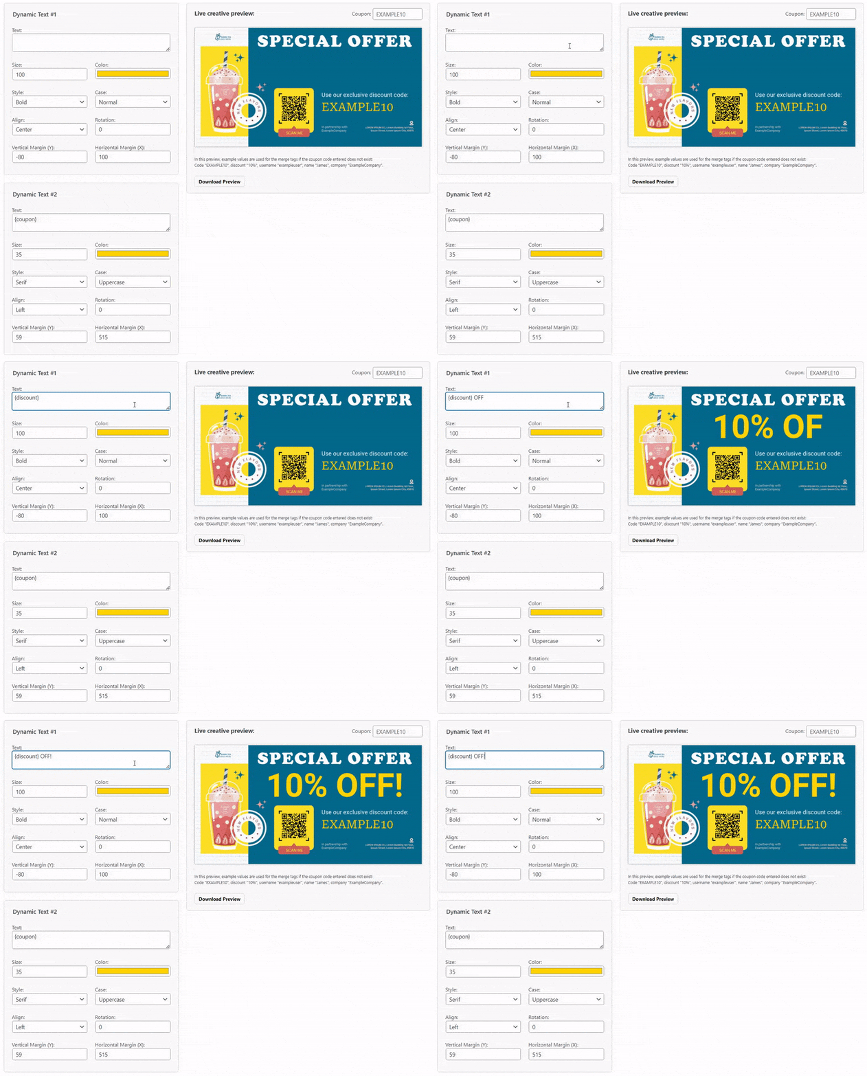
Through dynamic generation of banners, available with Coupon Affiliates, you can customize your banners elements such as text, coupon codes, discount amounts, and even QR codes, for each individual affiliate.
They will then see their own unique versions of each creative banner on their affiliate dashboard.

Scheduled and Seasonal Designs
Lastly, consider having special banners for different seasons or scheduled events. For instance, a holiday-themed banner during December might attract more clicks. A banner promoting a limited-time offer could create urgency and drive more conversions for a brief period.
How To Create Affiliate Banner Designs: A Step-by-Step Guide
Now that we’ve discussed the key elements and tips for creating successful affiliate banner designs, let’s delve into the step-by-step process of designing your affiliate banner.
This guide will help you implement the elements and tips discussed above.
Step One: Choose Your Design Platform or Tool
Various graphic design tools exist online, both free and paid, that offer a wide selection of design templates, fonts, colors, and images to choose from.
One popular tool is Canva, which offers a simple drag-and-drop interface that’s perfect for beginners.
Step Two: Implement the Key Elements and Tips
With your platform chosen, it’s now time to implement the key elements and tips discussed earlier.
Start by selecting a high-quality, relevant image, such as a photo of your product, and/or your logo.
Next, create a clear and concise message to communicate your offer.
Implement a compelling call to action to drive user engagement.
Don’t forget to consider your target audience’s preferences and ensure your banner design reflects your brand identity.
Here’s an example of a “Ridge” banner design:

Here’s an example of a “Purple” banner design:

Notice their simple messaging, clear images of the product, and call to action button.
Step Three: Finalize and Save Your Design
Once you’re satisfied with your banner design, it’s time to save it.
Ensure all text is easily readable, images are clear, and CTAs are prominent.
Save your design in a high-resolution format ready to upload to your affiliate platform.
Step Four: Add the Banner to Your Affiliate Program Dashboard
After your design is saved, the last step is adding it to your affiliate program dashboard.
This allows you to distribute it to your affiliates and track its performance.
Common Mistakes To Avoid in Affiliate Banner Design
When creating affiliate banners, it’s crucial to understand the common mistakes some stores make, and how to avoid them.Recognising these mistakes can help refine your design process and enhance the effectiveness of your banners, leading to a more profitable affiliate marketing campaign.
Overloading the Banner With Information
One of the most common mistakes in banner design is trying to convey too much information at once.
A cluttered banner can be overwhelming and unclear, leading to potential customers quickly moving on without engaging.
Instead, opt for a simple, clear design that communicates your offer effectively. Keep your messaging concise and your design elements purposeful.
Neglecting Mobile Optimization
In our increasingly mobile world, failing to optimize banner designs for mobile viewing can affect your conversion rates.
Mobile users now account for over half of web traffic worldwide, making mobile optimization a vital aspect of banner design.
Ensure your banners are responsive and display properly on various screen sizes to attract and engage with mobile users effectively.
Inconsistent Branding
Inconsistency in branding across your banners can confuse potential customers and affect your brand recognition.
Your branding elements such as colors, logo, typography, and messaging should remain consistent across all designs to build a strong, recognizable brand identity. It increases trust and encourages potential customers to engage with your banners.
Maximize the Use of Your Affiliate Banner Designs
Having successfully created engaging affiliate banner designs, you should now focus on effective distribution to maximize sales and conversions.
Implementing effective practices in banner distribution and performance monitoring is crucial in leveraging your banner designs for the most benefits.
Provide Banners in Different Sizes and Formats to Affiliates
One key way to maximize the use of your affiliate banners is by providing different sizes and formats suitable for various platforms and webpage placements.
This offers flexibility to your affiliates, allowing them to use the most suitable banner format for their site’s layout, or social media platform, resulting in improved impressions, click-through, and conversion rates.
Regularly Monitor and Tweak Banner Performance
Continuous monitoring and adjusting of your banners based on performance data is equally crucial in maintaining their effectiveness.
By tracking metrics such as click-through rates and conversions, you can identify which aspects of your banner design are working and which need improvement.
This allows for data-driven tweaks and updates to your banners for optimal performance.
Start Designing Your Affiliate Banners
Now that you have all these valuable insights and a step-by-step process, it’s time to start creating effective banners for your affiliate program.
Given the great potential of affiliate marketing to increase sales, there’s no better time to delve into designing or revamping your affiliate banners.
Finally, consider exploring the Coupon Affiliates plugin for WooCommerce, which offers a range of functionalities to support and optimize your affiliate marketing efforts, including dedicated “creatives” functionality for displaying banners on your affiliate dashboard, and even allows you to generate unique creatives for each of your affiliates dynamically.
By optimising your affiliate marketing strategy, you set yourself on the path for increased visibility and sales.
Try Coupon Affiliates PRO today, free for 7 days.
Elliot Sowersby is a WordPress developer from Yorkshire, United Kingdom. He is the founder and lead developer of Coupon Affiliates and RelyWP.


One Comment
Very useful and interesting